Interactive features visualization in KNIME
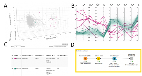
KNIME workflow to visualize a dataset described by multiple quantitative features (ex: a list of samples or cells, each described with multiple morphological features) as a 3D cloud of points (each point corresponding to one sample/cell) as well as a line plot (1 line per sample/cell).
For the 3D plot, the workflow uses Principal Component Analysis (PCA) for dimensionality reduction, ie it simplifies the information for each sample from n-features to 3 pseudo-features which are used as x,y,z-coordinates for each sample. The original features should cover similar value range, to make sure the PCA is not biased towards the large values features. One option is to normalize the values (min/max or Z-score).
Also make sure that the resulting PCA represents a decent % of the original data variance (at least 70%). Otherwise the PCA plot will not be representative of the original data-distribution. The % is shown in the title of the PCA plot.
The workflow is interactive and so selecting in one panel of the figure will highlight in the other panel too.
It was originally published for the visualization of phenotypic kidney features in zebrafish, but the workflow is generic by design and can be reused for any quantitative feature set.

